Why must designers pay close attention to how color is utilized within a composition?
If the color is used wrongly, it can make the client tired, dizzy.
Why is the color wheel an important tool for graphic designers?
It shows it the colors which are available for use or what with what makes what
Find an example of neutral colors utilized within a design (hint: google poster design). Near the sample, discuss why you feel the designer included neutral colors within the composition.
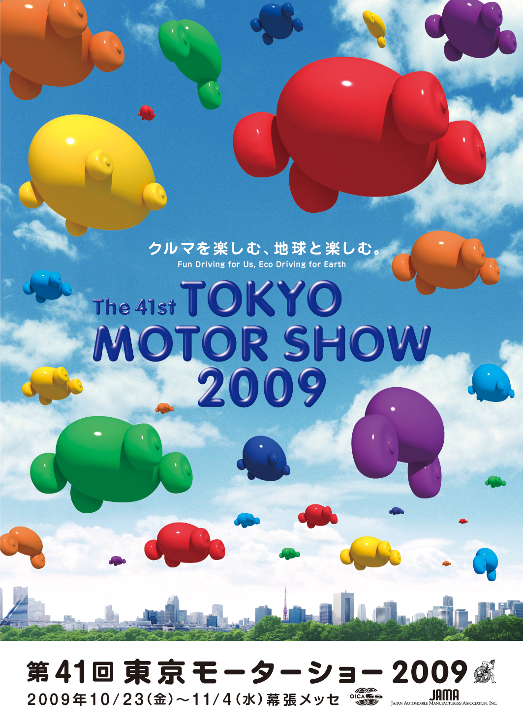
It has neutral colors because the colors of the balloons are mostly warm or cool colors with a lot of back ground space
Briefly describe how we "see" the color of an object?
The human eye and brain turn light into color light receptors in the eye transmit messages to the brain which produces color